SKF’s logo – a milestone in commercial design
US design historian Ezra Shales has just published an academic paper that hails the SKF logo as “a pioneer of corporate identity”. We find out why.
In 1934, the soon-to-be world-famous Museum of Modern Art (MoMA) in New York City held an exhibition called “Machine Art”, celebrating the geometric beauty of machines and components. That show, which is widely regarded as the first time that machine and daily artefacts were featured in an art museum exhibit, had a catalogue with a photo of an SKF ball bearing on its front cover.
This amazing moment in SKF’s early history was largely forgotten for decades, until US-based design historian Ezra Shales visited the company’s factory in Gothenburg, Sweden, in December 2018.
Found in a flea market

Shales, a professor at the Massachusetts College of Art and Design, was a Fulbright researcher who was in Gothenburg for six months to work at Röhsska museet, the city’s applied arts museum.
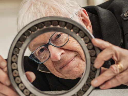
“But,” explains Shales, “due to the huge reorganization that was going on there, I was unable to get access to the museum’s archives. I happened to go to a flea market near the SKF Gothenburg factory and bought a ball bearing. I decided to go down to the factory and take a picture of myself holding the ball bearing up in front of it, and that got me thinking about the MoMA Machine Art exhibition.
“Then,” he continues, “I ended up visiting the SKF factory and spoke to a wonderful man called Lars Werner, who gave me a tour of the company’s museum. I’m very lucky that he let me in to see it because it’s not really open right now. That’s where I saw these framed advertising paste-ups by Alexander Tolf, who was a filer [mechanic] that rose through SKF’s ranks to become one of the company’s advertising executives.”
A pioneering brand identity
Consequently, Shales wrote a paper taking the Machine Art exhibition as its starting point and explaining why the 1934 show’s apparently plain treatment of the ball bearing as an anonymous industrial object overlooks the significance of SKF’s pioneering brand identity, especially the company’s logo, which was stamped on the back.
SKF’s logo is a cultural artefact that deserves reverence and reflection.
Ezra Shales, professor, history of art, Massachusetts College of Art and Design
“When we look at the history of commercial design we usually focus on the likes of German company AEG and the designer Peter Behrens as the main protagonists,” explains Shales. “But SKF was hugely significant in the development of the modern logo, and arguably it was more internationally known than some of the classic modern logo examples. SKF had an advertising department as early as 1911, and Alexander Tolf was crucial in its development. The company logo was very successful in conveying what the company stood for. It was a pioneer of corporate identity.”
Although the logo was slightly updated in the 1980s, Shales argues that its original iteration has a timelessness that gives it a special quality.

More than 100 years old and still modern
“The logo is a magical object,” he says. “It was hand-drawn but looks so mechanically rendered the way it’s squared off, and if I were to tell people that it was created in the 1960s I’m sure they’d believe me. People are very surprised when I explain that it goes back to 1908, with a little revision in 1913.”
The academic paper, titled “Beautiful, plain objects like [SKF] ball bearings: The Enigma of Aestheticizing Anonymity in ‘Machine Art’ and Modernist Logotypes”, was published in the Journal of Design History in February 2022. Shales says he is delighted by its reception.
“I’ve had a great response to the paper,” he says. “People really like the fact that I have managed to make a story about the artisanal qualities of the logo more human. It’s a cultural artefact that deserves reverence and reflection. We’ll each have our own understanding and identification of what it means to us, and as with most things that appear simple at first glance, the SKF logo is wonderfully complex.”